
I did a post awhile back on colours to use in a room with red accents, for my Australian bloggy friend Kerry from A Tranquil Townhouse. Soon after, Sarah, at All Our Fingers in the Pie, emailed me from Saskatchewan and asked for some ideas of what colour to paint her new living room to go with a seafoam sofa and brown chairs. She sent me a photo of her living room in her previous house and, between you and me, I thought it looked great. Why change?

Well we all know the drill - new house, need to change things up, tired of the old paint colour etc etc. So I volunteered to put my Google fingers to work and find her some inspiration.
I did run into a couple of problems though. First, most of the rooms I found had the seafoam colour on the walls, not on the sofa. Soooo that means you'll have to use your imagination and sometimes picture the wall colour as the sofa and vice versa. It's a little complex, but I think we can do it. The other problem was that when I googled seafoam there was quite a range of colours from a seafoam that was similar to Sarah's sofa, to a light aqua, to a light turquoise, to a light blue. So again I implore you to use your imagination and picture the seafoam of Sarah's sofa in all the photos.
I had my post written with colours grouped around complimentary colours (opposite on the colour wheel), analogous colours (adjacent colours on the colour wheel), monochromatic (different values of the same colour), and neutral colours (both light and dark), when I thought I'd better check Maria's blog, Colour me Happy, to see if she would agree. Well I got reading this post and actually laughed when I realized how I had fallen into the amateur trap. So I got to work and thought about the colours again, and came up with a new way to organize them - based on colours that provide high contrast with seafoam and colours that provide low contrast. See what you think.
(I must confess I've been a bad blogger and I no longer remember where I got most of these photos from, so if you know, then please let me know and then we can all know).
HIGH CONTRAST COLOURS (yellow, gold, orange, pink, red, purple) - these colours add a real pop of colour because of their contrast to seafoam. I'm thinking this is because they are further away from seafoam on the colour wheel (see I really am an amateur, I can't help referring to the colour wheel). In my mind Sarah's sofa has a grey undertone so she needs to find a more muted version of the high contrast colours. These colours could work as a wall colour, but since they are so intense, would more likely be used as accent colours or as part of a patterned material.


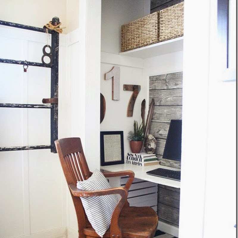
HIGH CONTRAST NEUTRALS (dark gray, dark brown, black). This could be a bit intense if all the walls were painted such a dark colour, but it could look stunning on an accent wall behind the seafoam sofa.


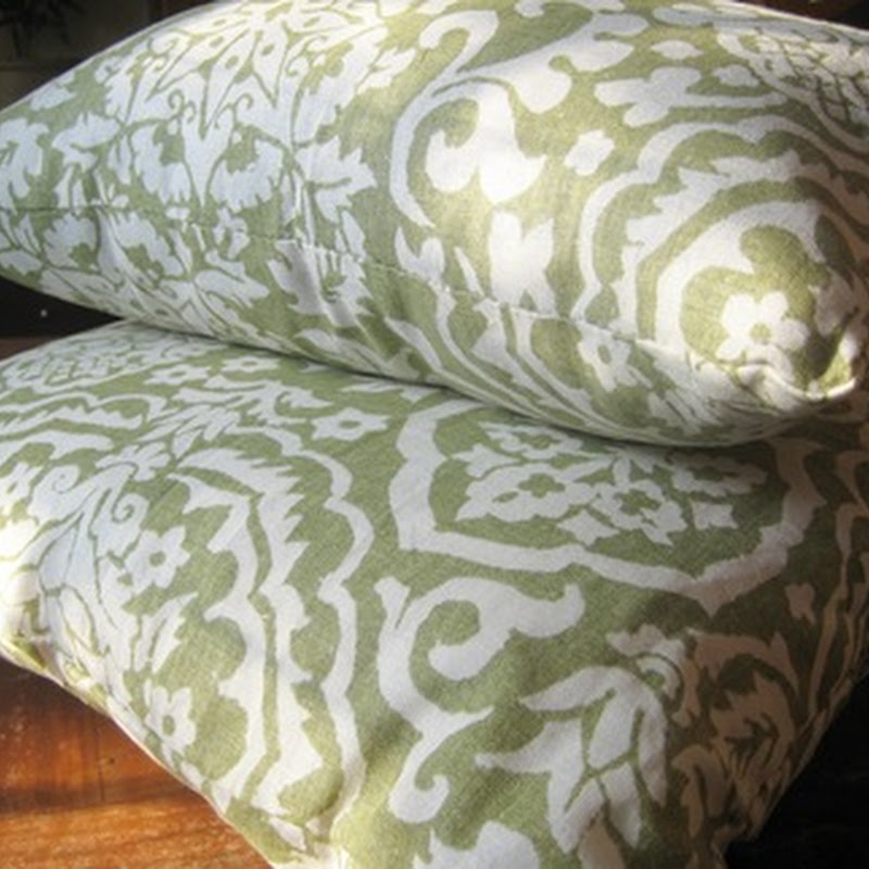
LOW CONTRAST COLOURS (green, blue, teal) - This provides a softer look than the high contrast colours, because the colours are closer to seafoam on the colours wheel (see there I go again).


What is your favourite colour to use with aqua/seafoam?
Are you wondering what colours go with red. Check here for inspiration photos.
And here for green room inspiration photos.
And here for sunny yellow rooms.
And here for orange rooms.


Well we all know the drill - new house, need to change things up, tired of the old paint colour etc etc. So I volunteered to put my Google fingers to work and find her some inspiration.
I did run into a couple of problems though. First, most of the rooms I found had the seafoam colour on the walls, not on the sofa. Soooo that means you'll have to use your imagination and sometimes picture the wall colour as the sofa and vice versa. It's a little complex, but I think we can do it. The other problem was that when I googled seafoam there was quite a range of colours from a seafoam that was similar to Sarah's sofa, to a light aqua, to a light turquoise, to a light blue. So again I implore you to use your imagination and picture the seafoam of Sarah's sofa in all the photos.
I had my post written with colours grouped around complimentary colours (opposite on the colour wheel), analogous colours (adjacent colours on the colour wheel), monochromatic (different values of the same colour), and neutral colours (both light and dark), when I thought I'd better check Maria's blog, Colour me Happy, to see if she would agree. Well I got reading this post and actually laughed when I realized how I had fallen into the amateur trap. So I got to work and thought about the colours again, and came up with a new way to organize them - based on colours that provide high contrast with seafoam and colours that provide low contrast. See what you think.
(I must confess I've been a bad blogger and I no longer remember where I got most of these photos from, so if you know, then please let me know and then we can all know).
HIGH CONTRAST COLOURS (yellow, gold, orange, pink, red, purple) - these colours add a real pop of colour because of their contrast to seafoam. I'm thinking this is because they are further away from seafoam on the colour wheel (see I really am an amateur, I can't help referring to the colour wheel). In my mind Sarah's sofa has a grey undertone so she needs to find a more muted version of the high contrast colours. These colours could work as a wall colour, but since they are so intense, would more likely be used as accent colours or as part of a patterned material.


from Marie Claire Maison via Down and Out Chic
HIGH CONTRAST NEUTRALS (dark gray, dark brown, black). This could be a bit intense if all the walls were painted such a dark colour, but it could look stunning on an accent wall behind the seafoam sofa.

from Decorpad
LOW CONTRAST COLOURS (green, blue, teal) - This provides a softer look than the high contrast colours, because the colours are closer to seafoam on the colours wheel (see there I go again).


David Hicks from Studio Wellspring
Using different values of seafoam will provide the calmest look of all, as it is just lighter and darker tones of one colour. This is what Sarah did in her last house, although she could go darker on the walls like in the photo below.

from Decorpad
LOW CONTRAST NEUTRALS (white, champagne, cream, linen, beige). This is probably the safest route to go and would be very easy to live with.


House Beautiful


from Decorpad

from Decorpad


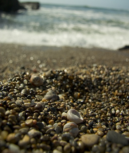
I couldn't leave a post about seafoam without a couple of photos of actual seafoam.

What is your favourite colour to use with aqua/seafoam?
Are you wondering what colours go with red. Check here for inspiration photos.
And here for green room inspiration photos.
And here for sunny yellow rooms.
And here for orange rooms.


.jpg)


Gorgeous, gorgeous, gorgeous Grace...you picked my favourite colour and put together a great post!!!
ReplyDeletejeanne:)
PS..thanks for following...I look forward to following you too :)
How fun. I love her sofa and it looks great in the color it's in. I think just changing her drapes to tie it all together would look pretty. Of course I like the seafoam, brown and add red but I also love the seafaom, brown and add blue and lots of white. Those are great pictures of wonderful ideas. Can't wait to see what she likes.
ReplyDeleteGrace! What a lot of research you did! I love all the pictures.
ReplyDeleteI was also choosing a colour for the exterior of my house, and decided to throw a swatch on the living room wall and really liked it. It is the almost the same colour as in your 'dark neutral' picture but I just came across it by accident! A lot like the bed cover in one of the pics. I actually have a bed cover in the same colour. Sometimes the answers are so obvious that you don't see them.
I had not thought to throw some red in with that. So should all the walls be the dark neutral or just use it on the big wall behind the sofa? I am just thinking that this is a small house. Thanks for all the inspiration!
Her couch is beautiful but I'm not seeing sea foam when I look at it. I think it might be the wall color or drapes that is making it read sea foam but like you said it has a lot of gray undertones. It's very neutral and she could go a lot of different ways with it. Depending on the mood she wants to create. Great inspirational pics!
ReplyDeleteI am so loving this colour seafoam Grace!
ReplyDeleteThe colours that i like as a contrast are the photo of the living room with the yellow gold pillows...it really pops. I like the photo of the orange red cabinet with the sea foam and lastly i love the photo of the table and chairs that are striped green and blues perfect i think!
I like the picture of the surf crashing on the beach. I think the colours are great. Another cue, look to nature. Good idea. I'm not sure that I really like a lot of red with the darker neutral brown scheme.
ReplyDeleteHi gracie, Love all the images you used as examples. I like plain white with seafoam nothing more peaceful to me. The image of the ocean just about made me fall off of my chair. Great post with so much work on your part, thank you,Kathysue
ReplyDeleteHi Grace,
ReplyDeleteI love all the image you have found with the seafoam. Thanks for sharing.
Just found your blog, and it's lovely. :)
ReplyDeleteI wish I liked seafoam. Even though I grew up in Florida and adore the beaches, I just don't care for that color in decorating. Our small 1962 ranch home had brand-new seafoam green carpet installed just before we bought it nearly 10 years ago, and we didn't have the heart to rip it all out, even though we know there are hardwood floors under the carpeting. The color doesn't go with anything we own and it grates on me every day. I'm battling stage IV cancer and the very thought of the work that would need to go into pulling up that carpet--especially if the floors need to be refinished--is just too overwhelming. So I guess I needed the inspiration of this post to help me figure out ways to live with the color. Thanks! :)
beautiful images. some of my all-time favorites were in there. just beautiful.
ReplyDelete~janet